Brand Guide
Identity Design
Brand Guide and Identity for
California-based real estate brokerage

Atlasa

About project

Atlasa is the California-based data-driven real estate brokerage, a sophisticated analytical, smart, and data solution.

Challenge

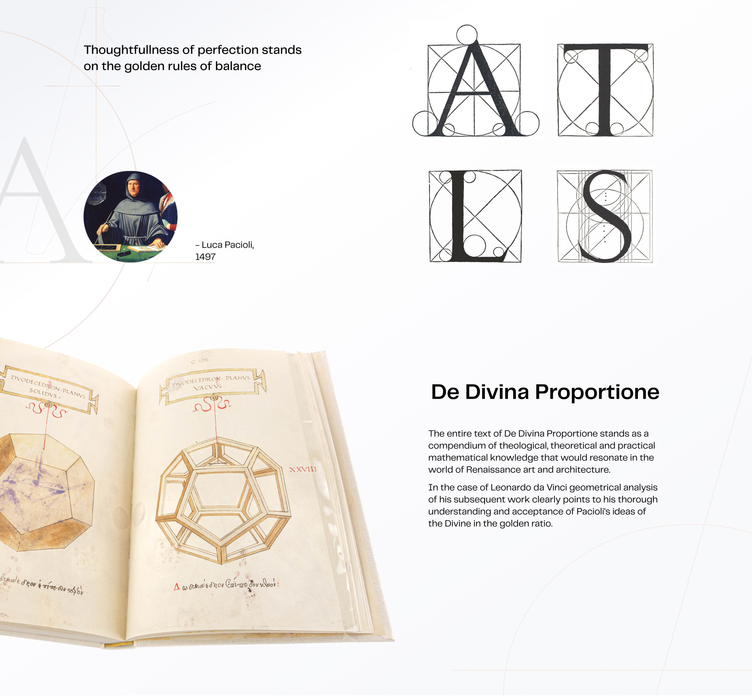
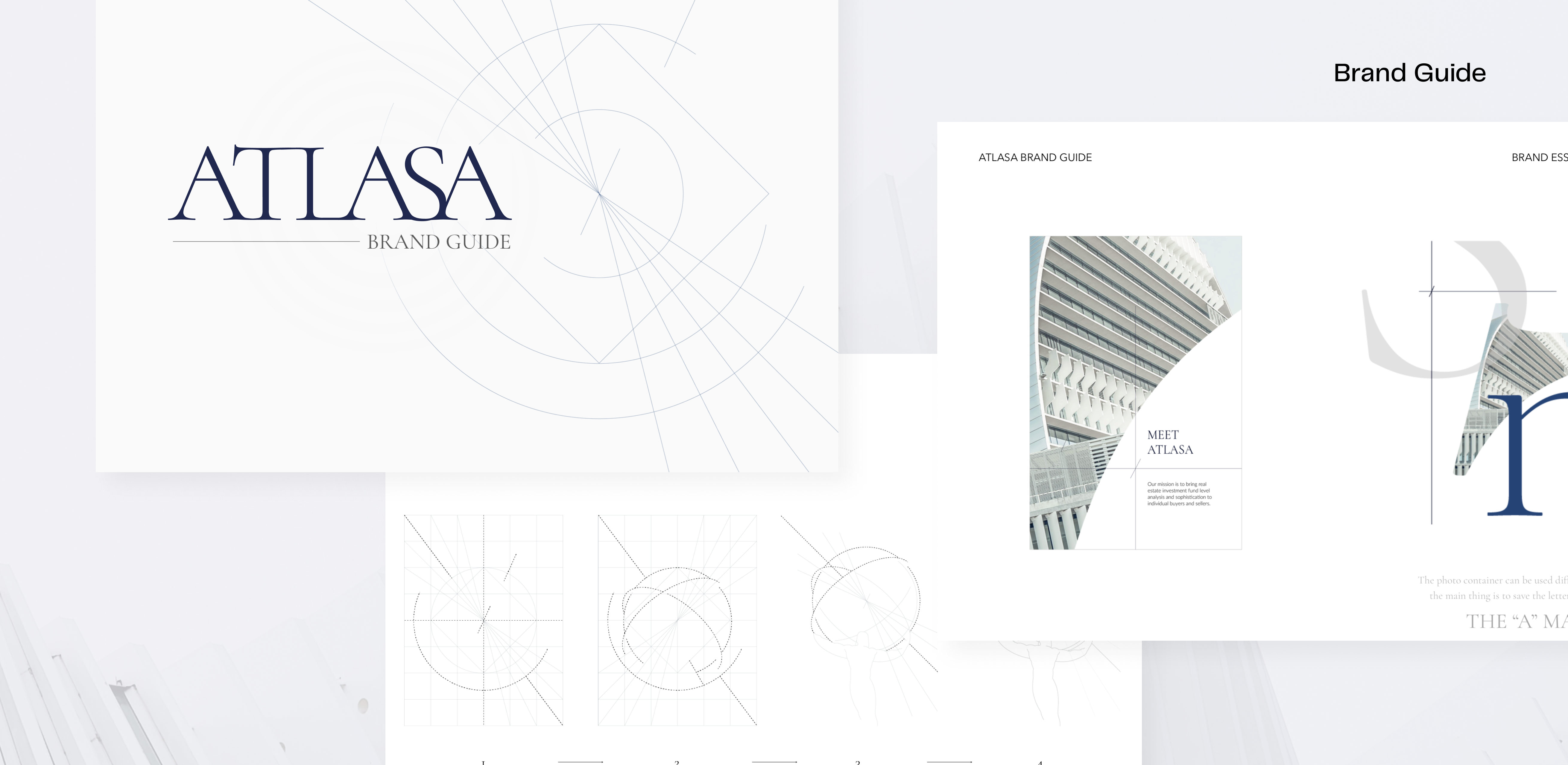
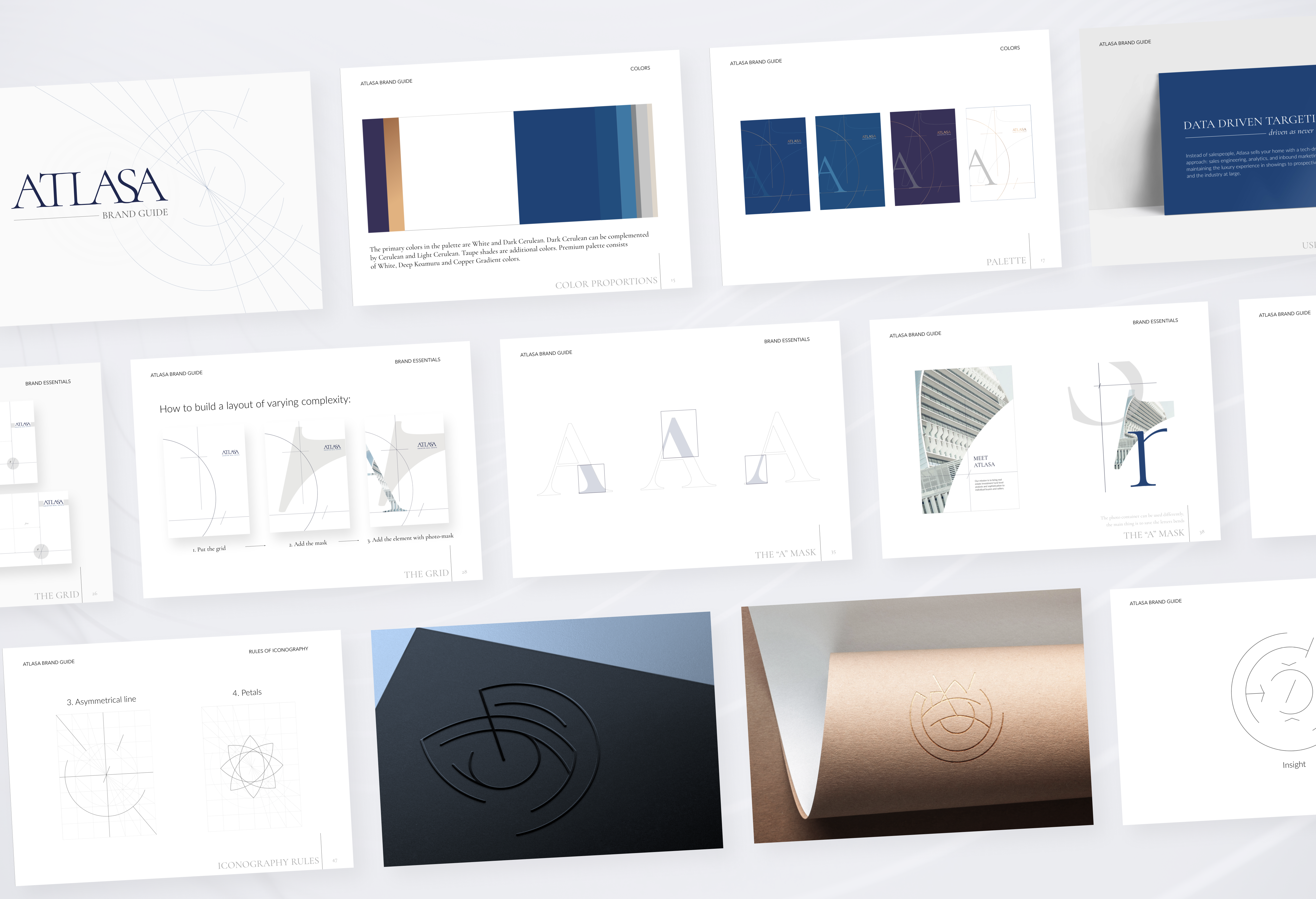
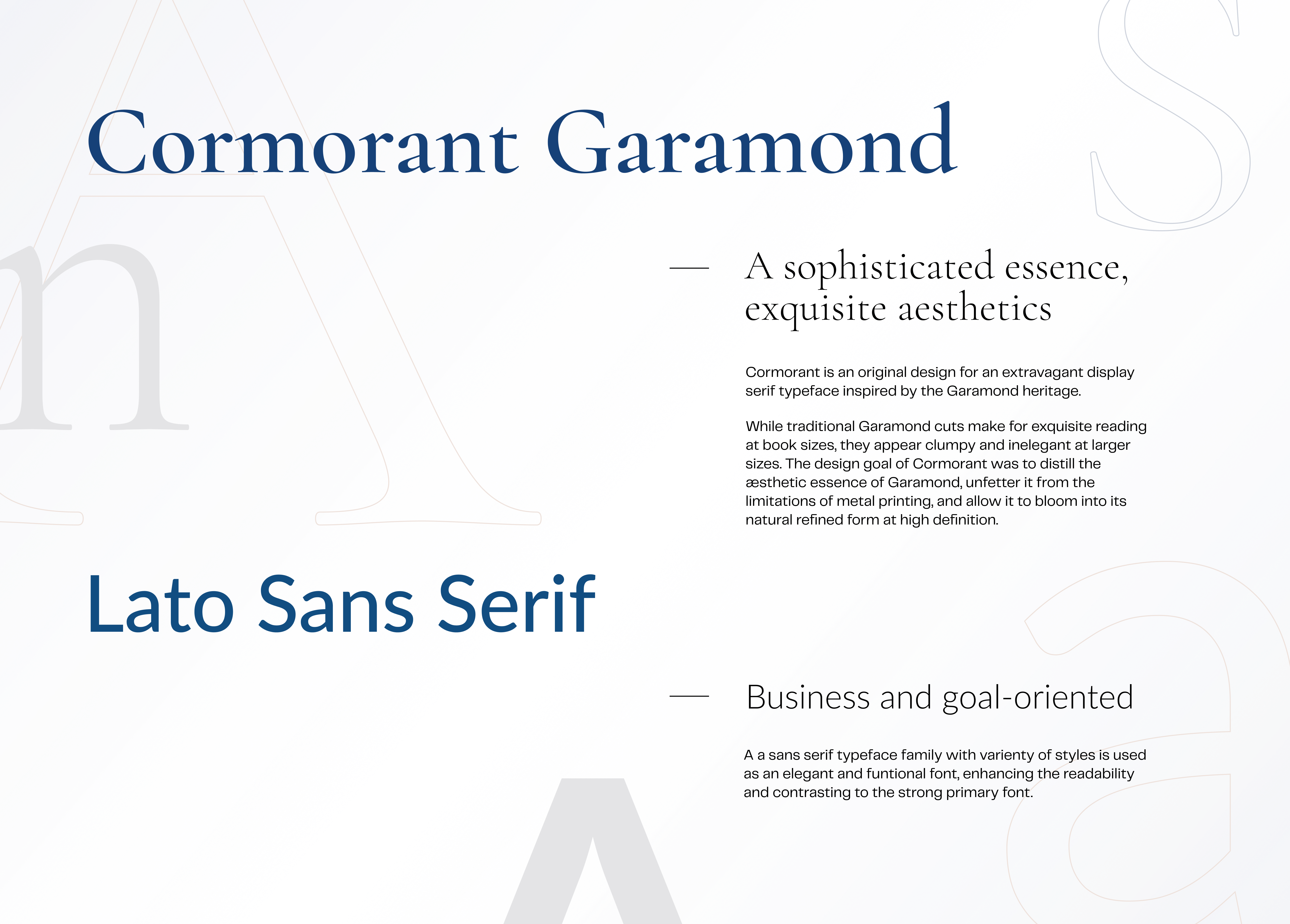
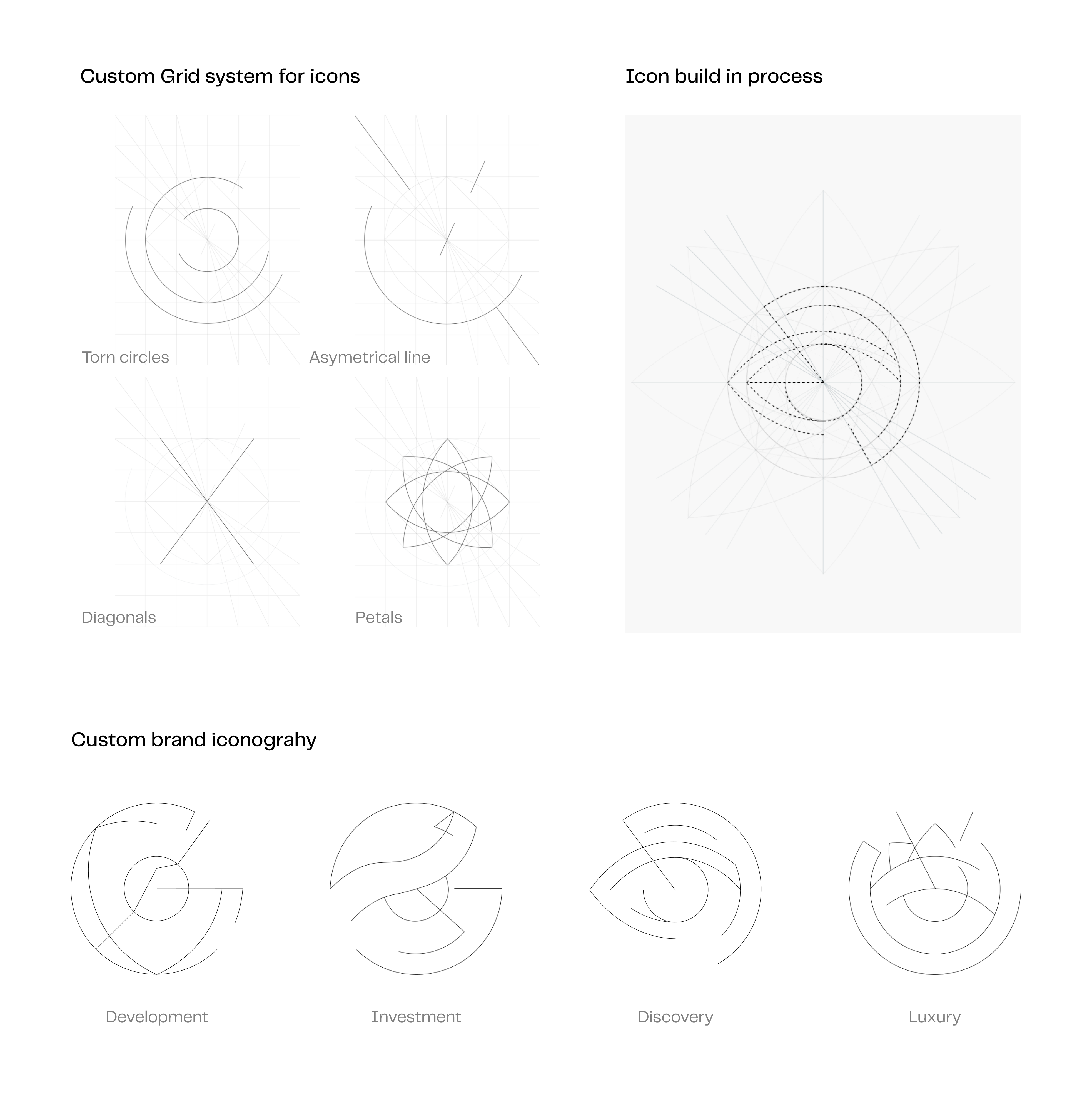
Developing their Brand Guide and the set of presentations, we’ve been taking our inspiration in the heritage of Da Vinci and Luca Pacioli. We’ve resulted in the timeless style where the classy luxury meets the intelligence of the XXI century.

The concept

We’ve addressed an in-depth study of the golden ratio in geometry and art called ‘De Divina Proportione’, by Luca Pacioli, 1497. De Divina Proportione embodies the moment in the Italian Renaissance when art and science collide to spectacular effect.

The printed Divina Proportione includes 59 full-page woodcuts of solid and open geometric forms after Leonardo da Vinci’s drawings

Work process

  • 01
    Interview & inspitation
    @client team
  • 02
    Concept & logo design
    @Unicorns
  • 03
    Brand identity design
    @Unicorns
  • 04
    Brand Guide dev
    @Unicorns

Unicorn’s work

Developed
We’ve developed the Brand Identity essentials, including fully custom iconography
  • 01
    Concept & Logo
  • 02
    Colors & Fonts
  • 03
    Brand
    Layout
  • 04
    Custom
    Iconography
  • 05
    Photography
    style
Colors & Palette
The primary colors in the palette are White and Dark Cerulean can be complemented by Cerulean and Light Cerulean. Taupe Gray, Lavender Gray, Bone - are additional Colors. Premium palette consist of White, Deep Koamuru and Cooper Gradient colors
Typography
Typography is an essential component of visual identity. Our brand font, Cormorant Garamond, gives us an exquisite voice that’s both luxurious and dominant while ensuring conformity across all touchpoints and forms of communication.

The identity places a heavy emphasis on the minimalism of expression. The fonts selected create a visual coherence across all our communication and help us to increase recognition and strengthen our brand
The “A”
 frame
The "A" frame speaks out leadership in a smooth, exquisite way. The A-frame can be used as the linear, brand color-filled, or a photo frame variation, with any of the letters of the brand name (“A”, “T”, “L”, “S”) with the key requirement to save the trim effect.
Iconography
We’ve developed the principles of how brand custom icons are being built: that included custom grid system and rules of usage.
In Unicorn’s own words
Shirin Etessam
Creative Partner
The Brand identity is representative of what the brand stands for, it has to spell luxury, second would be real estate and third would be high tech/data. Visually we are respected luxury. Modern, but trusted. High-tech. Sharp. Architectural. Well-Engineered. Thought-Leader.
Getting inspiration in geometry, the Renaissance, the golden ratio and “Leonardo Da Vinci” exposition in Louvre was unforgettable. It’s been a challange to visualize how the real estate meets AI and moreover, when it’s a luxury brand, but I believe we’ve nailed it!
Katya Tsygankova
Art Director
Delivered
Content
Logo
Brand identity
Brand Guide Book
Brand grid
Brand colors & fonts
Custom iconography
Photography rules
Credits
  • Art Director - Katya Tsygankova
  • Conceptual Art Director - Tanya Skrynnik
  • Art & history advisor - Denis Levchenko
  • Project Lead - Anna Leskova
  • Designer - Daria Kryuchek

Do you need a Pitch Deck for your startup?